Modular Product Detail Page Framework
Streamlining Business Configuration and Customization with Scalable Card Variants
Overview
When designing a complex app with multiple product categories and business types, we needed to establish a unified page structure to maintain a cohesive user experience across the platform. This structure, serves as the backbone for the app’s layout and content, ensuring consistency in the overall experience.
Further, to accommodate the unique business needs of each business unit and brand, we developed configurable variants for each card. These variants are tailored to meet the specific commercial goals of different business units while still aligning with the platform’s overarching experience. By consolidating similar business requirements, we designed a flexible yet efficient system that delivers the maximum amount of customization with minimal variations—ensuring scalability, ease of implementation, and consistency across the app.
Team
Lead UX Designer

UX Designer
UI Designers
Business units
Skills
Cross-Functional Communication
Designing Scalable System
Design Operations
Timeline
2023 Q3-Q4
Genre
Product Detail Page,
Design Framework
Tool
Figma
Planning for the Framework
With my lead UX designer, I helped break down the overall goal into three focus areas — business goals, user experience, and agility — and translated them into tangible UI guidelines.
We built a three-tier page structure: page sections, cards, and variants, creating a modular system that scales across business units and supports flexible customization.
Overall Goal
A flexible, adaptable page layout that serves the diverse needs of different business units while maintaining overall consistency and efficiency
Goals
Business Flexibility
Ensure each business unit can highlight their unique products and promotions while supporting the platform’s overall objectives.
Iteration Agility
Facilitate data-driven iterations and optimizations that align with user behavior, driving higher conversion rates.
Development Efficiency
Design with scalability in mind, ensuring UI components are reusable and easy to maintain, reducing development time and cost.
Design Breakdown


Page Section
The page is divided into several sections, each designed to fulfill different user and business needs by presenting specific information:
Page Section 1: Key product info. to drive initial user engagement
Page Section 2: Specs and platform services for trust-building and guiding the user towards a decision
Page Section 3: Reviews, pricing, , and add on services to facilitate the final conversion decision
Card in each screen
The page is divided into multiple floors, each representing a section of the content:
Card 1: Contains high-priority content, including product images and promotional banners.
Card 2: Focuses on category-specific product information (e.g., specifications, customer reviews).
Card 3: Provides additional information, such as related products and offers.
Option1
Option2
Card Variants
Within each floor, variants are created to accommodate the unique needs of different business units, enabling tailored content display while maintaining the overall design consistency.
Page Section & Cards
This framework ensures overall unified user experience across categories (business unit’s products) & brands.
[Note]
For clarity, I’ve translated all UI elements into English. In the actual app, the typography and layout follow the Chinese characters.
Card in each screen
Page Section
Page Section 2
Product-related details
Page Section 3 - n
Third-party information and add-on shopping
Page Section 1
Key product information
images
price
discounts
brand
Product Name (Title)
Sales Ranking*
specifications
shipping info.
Tailored Shopping Guidance
platform and merchant services
buyer reviews
images and video reviews
buyers Q&A
Platform Salesperson Reviews

Cards Variants
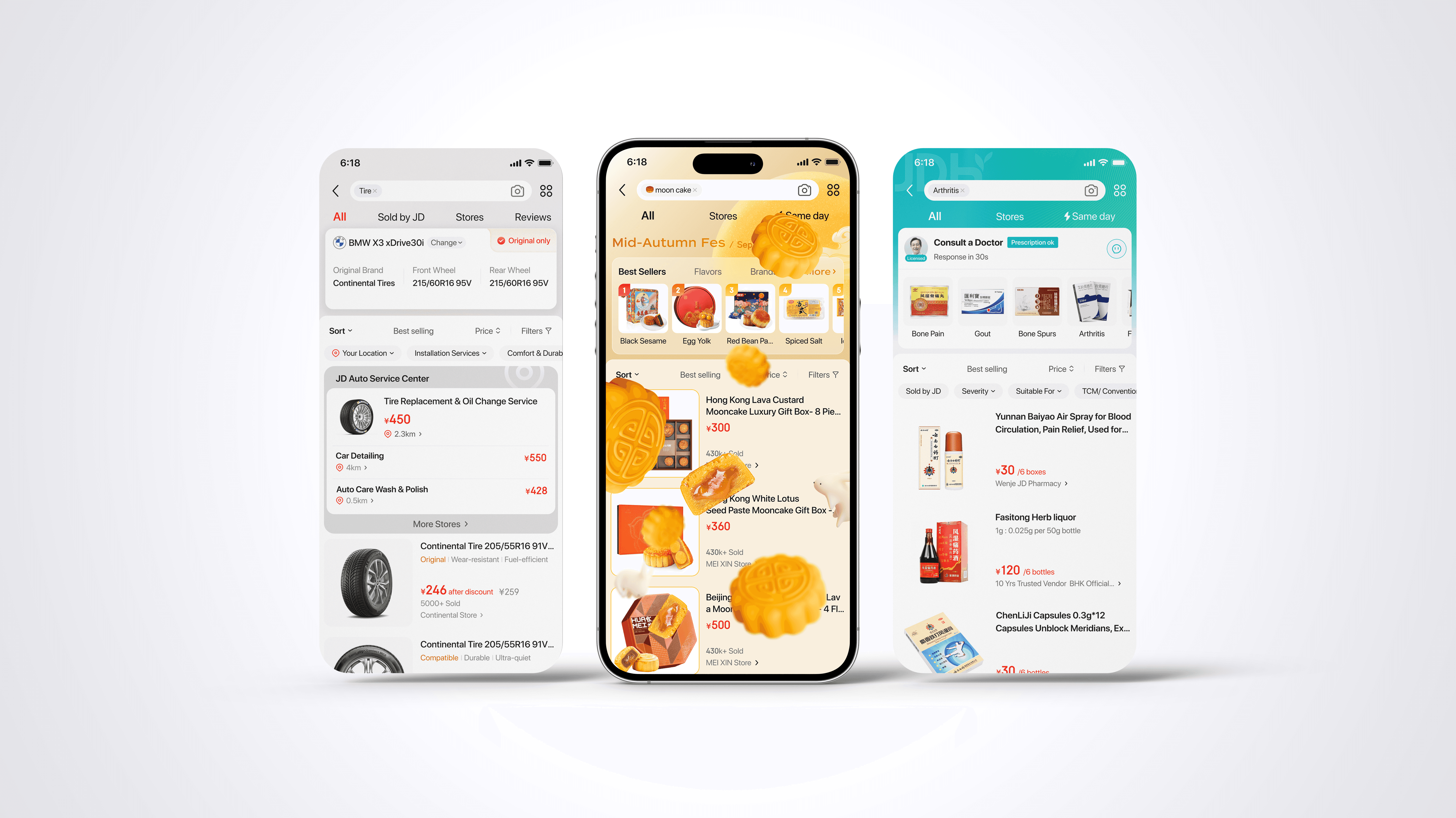
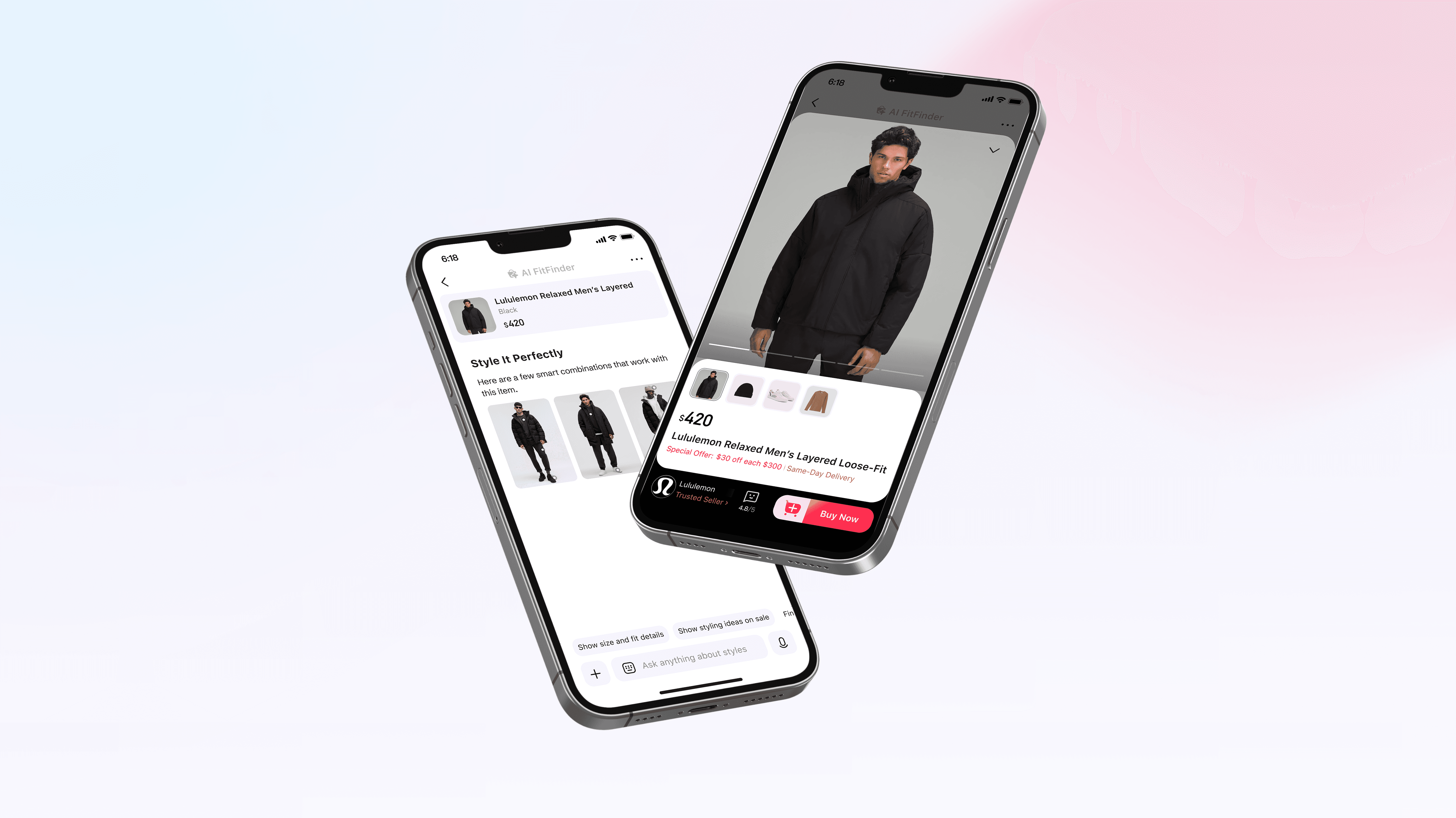
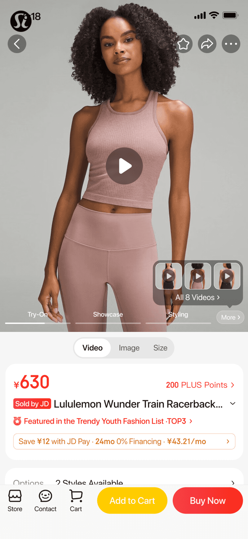
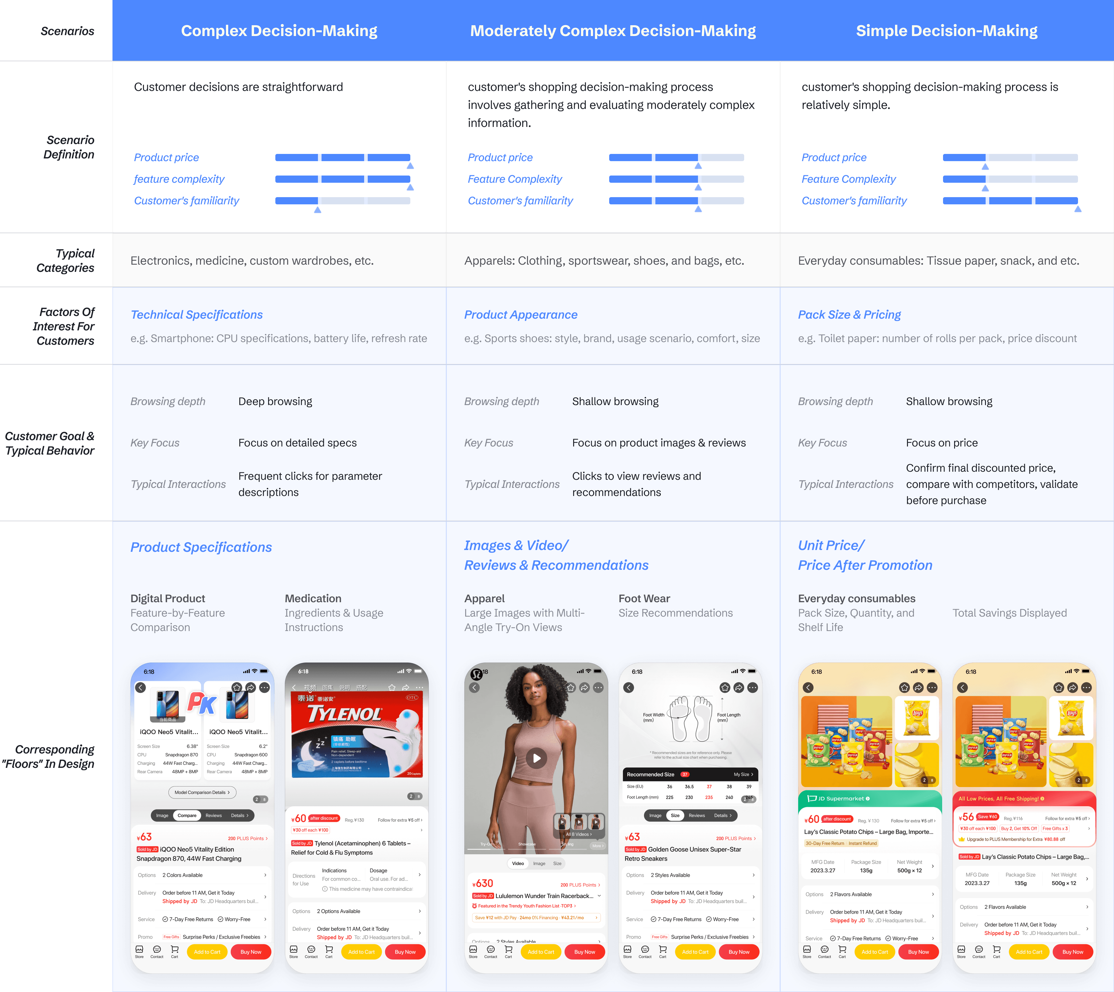
Based on Data research and user testing insights, we structured the three key variable cards and aligned them with category-specific display, tailored to different decision-making scenarios. The following are some example categories’ page design.
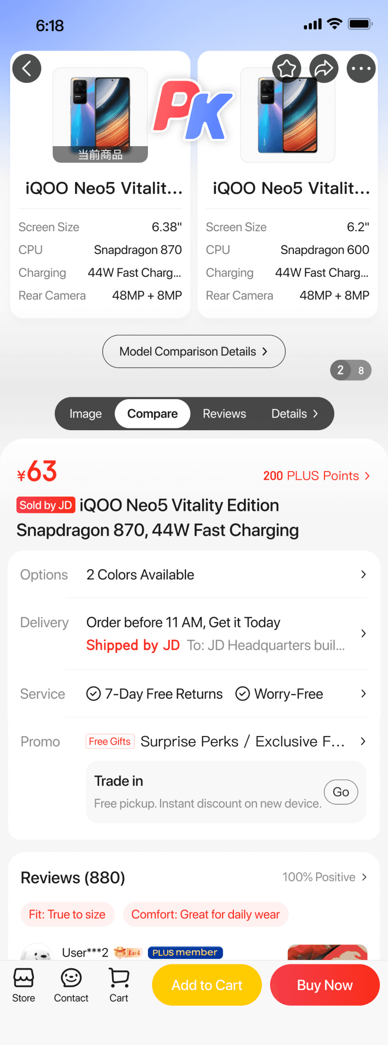

Complex decision-making
Product specifications & Comparison
Fit & Size Guide
Multiple packaging views
Online-only offer
Package size & Unit Price
Trade in Service
Moderately complex decision-making
Simple decision-making

The Analysis Artifact
Blurred due to disclosure reasons
Full Template


Ralated Projects