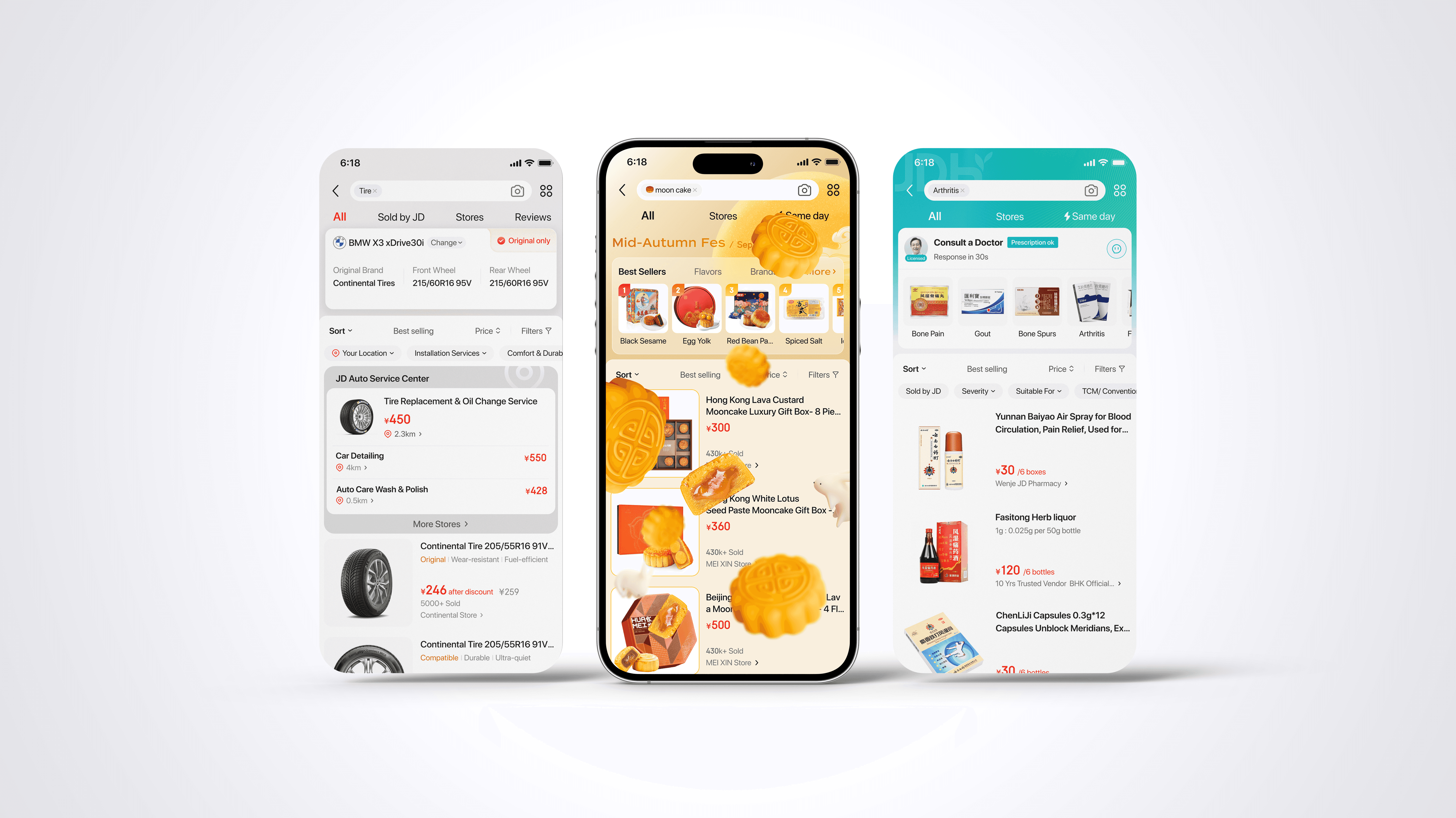
OneBox — Brand-First Design for Impact
Connected user insights with JD’s core brand strengths
Overview
Context
Designed to emphasize JD.com’s unique service advantages, OneBox is a product comparison feature that differentiates the platform from competitors. It highlights the lowest price, fastest delivery, and best warranty—surfacing three top picks that simplify product evaluation and reduce decision friction.
Challenge
The challenge was that OneBox lived across separate modules owned by different teams, creating an inconsistent flow and fragmented user experience. Critical entry points were also missing, limiting visibility and adoption.
Opportunity
This redesign established a unified, brand-led experience that connects user intent with JD’s business advantage. By consolidating design across modules, reintroducing strategic touchpoints, and clarifying value communication, the new OneBox reinforces JD’s brand promise while improving user trust and conversion efficiency.
Team
Product Manager

Led UX Designer
UI Designer
Skills
Experience Strategy
Cross-Functional Collaboration
Conversion-Centric UX
Outcome
Improvement in Category UCVR 0.45%
Timeline
2023 Q3
Role
UX Designer
Module
Search & Feed
Purchase Path
Order Management
Tool
Figma
Feature Overview & Status
OneBox is designed to improve the experience for users searching for a specific brand and model, where multiple suppliers compete on promotions, services, and price.
After proving its effectiveness in initial testing, the feature is now entering an experience upgrade phase. With data-verified impact, the design and product team secured cross-platform-module resources and is collaborating with multiple platform modules to deliver a smoother, unified user flow.
Problem Definition
From the design audit and business review, I identified three core gaps:
1
Lack of a clear and consistent visual anchor
The feature had no strong visual identity to communicate its unique value across contexts, leading to weak discoverability and user recognition.
2
Missing presence at high-intent moments in the user journey
While the shopping flow includes several stages where users have a strong need to compare offers (e.g., cart), the feature was not surfaced.
3
Overemphasis on price-based value
The current design primarily focuses on price comparison, failing to engage users who care about other differentiators such as fast shipping, reliable service, and quality assurance—which are core to JD’s brand promise.

Search & Feed
Purchase Path
Order Management (Cart)


Unclear branding causes user confusion and weakens trust
Misaligned User Perception
Touch Points

Onebox Landing Page V2.0
Landing Page
Conversion
Post-Purchase

High compare demand at checkout, yet no entry point provided
Missing Touchpoint

Comparison limited to price — ignores delivery speed and service benefits
Limited Options with Price-Only Sorting
Modules
Pain Points
Key Insight
The true opportunity lies where business objectives and user motivations intersect.
JD’s market advantage isn’t only low pricing — it’s speed, service, and quality assurance.
By reframing the problem from “price competition” to “trust and service differentiation,” we can strengthen OneBox’s alignment with JD’s brand promise and user expectations.
Design Strategy
To translate this insight into actionable design direction, I defined two core focus areas:
Visual Communication & Value Framing — Establish a layered visual system for OneBox — using “Low Price” as an entry-level trigger to drive clicks, while reinforcing JD’s core strengths of fast shipping, quality assurance, and service within the feature.
Journey Touchpoints & Information Architecture — Introduce contextually relevant entry points so users can access OneBox when their comparison need is highest.
This dual-track strategy ensured alignment between business visibility and user relevance, turning an operational feature into a recognizable and trusted experience.
pain-points
Unclear Visuals & Branding
Users struggle to recognize the feature’s value. Inconsistent visuals weaken brand perception and fail to highlight JD.com’s advantages.
Price-Only Sorting
Comparison is limited to price, overlooking JD’s other differentiators like delivery speed and service quality.
Missing Touchpoint
Key moments in the shopping journey lack entry points for comparison, leaving user needs unmet.
🎯 Goal
Clarify Feature Value
Make the feature’s value immediately clear while reinforcing JD’s core strengths
Expand Journey Coverage
Surface OneBox across key user decision stages to increase relevance and conversion confidence.
Strategies
A
Visual Redesign + New Ranking Criteria
Highlight JD.com’s three differentiators—lowest price (what draws users to click), fastest delivery, best warranty (jd’s brand image)—through visual cues and added ranking options.
B
Touchpoint Mapping & Flow Optimization
Integrate OneBox entry points into high-intent user journey stages. Tailor the displayed key decision-making information based on the user’s CTA at each stage.
Design Solutions
A
Visual Redesign + New Ranking Criteria
Logo Visual
Price Drop Icon
Concept Iterations
Price Drop + Comparison
Literal Chinese Character Concept
(price competition)
Badge – Lowest Price
Header Component
Entry Point – Large
Entry Point – Small
Badge – Fastest Shipping
Badge – Best Service
80件同款在售 低至¥6600

¥8756.00
销量第1名
46分钟达
苹果北京旗舰店
80件同款商品在售
同品低价
配送更快
品质优选
System Integration
Final Icon
Showcase JD.com’s differentiators
Business Value
Reduce decision fatigue and build confidence in purchase choices
User Value
Rank Criterias — JD’s core strengths
Competitive pricing


Trust and quality assurance

Instant fulfillment
B
Touchpoint Mapping & Flow Optimization
Building on the proven data from the last release, we secured a new entry point placement within the Cart module.
All touchpoints were consistent with the new visual, while the information at each entry was tailored to match the user’s goal clarity at different decision stages — ensuring relevance without cognitive overload.


Search & Feed
Purchase Path
Order Management (Cart Page)


Modules
Touch Points

Onebox Landing Page V3.0
Landing Page
Conversion
Post-Purchase

Results After Launch
Product Detail Page V2.0
Search Result Page V3.0
Feb, 2023 launched |
full rollout AB Test with Version 2.0 vs. Version 1.0
Oct, 2023 launched |
Cut by 5% AB Test with Version 1.0 vs. without
Entry Click-Through Rate Uplift
9.5
%
Previous version: 0.3%
Purchase Conversion Rate Uplift
0.06
%
UCVR = Total Order Lines / Search UV
Entry Click-Through Rate
0.75
%
Entry CTR = Entry Clicks / Entry Impressions
Category UCVR Uplift
0.45
%
UCVR = Total Order Lines / Search UV


Related Projects


